When considering my target audience, I wanted to aim at someone with an interest in Alternative Hip-hop/Rock, as this appeals to a whide variety of people who have similar interests to myself.
Here is an example of the type of music my chosen audience would likely listen to:
http://www.youtube.com/watch?v=P0SxFZbt5u8
And
http://www.youtube.com/watch?v=6NUxMgzHdic&feature=fvst
These artists combine aspects of both Rock and Hip-Hop in both their image and their songs.
Wednesday, 31 March 2010
Double sided spread

After consideration, I noticed that my spread was set out in an odd way that I have never seen from a magazine, I noticed that these magazines have various columns that allow larger stories to be transfered onto the next page. I used this method in order to continue and conclude my story on H-J-C.
Rather than incorporate smaller stories as I originally intended, I dedicated my double sided spread to one story regarding H-J-C, featuring quotes and an announcement for an upcoming concert, which I found to be a common convention of magazines.
Contents page

After looking at various content pages for magazines, I decided on using this page to have some short stories instead of forcing them onto other pages, this is a typical convention I have seen in magazines such as NME.
Front Cover

This is my final front cover. I have tried to use typical conventions of a music magazine for this cover.
Originally, I envisioned a seating area of my school to be the seating of a concert. Not having access to a concert hall, I thought this was an interesting alternative that I wanted to incorporate into my front cover.
However, I ultimately decided against this in favour of a midshot of myself, as I began to look at more magazine front covers, I knew my original choice would not work.
Evidence of my house style can be seen in the text colouring and the text itself, which is consistant throughout the magazine.
Tuesday, 30 March 2010
Evaluation.
I would choose a big name distributor as they would allow me to market my product to the relevant audience easily and in a variety of ways. I am aiming my magazine at 14-19 year olds who are likely to spend a lot of time online. Because of this I would advertise the magazine online on network sites such as Facebook, Myspace, Twitter and YouTube as well as iTunes. As the target audience are more likely to download music rather than journey to record stores or retailers, so I will primarily focus on the online advertising, as this is likely to increasing the range of the audience to some degree whilst still having some advertisements in stores and television. The magazine is likely to be sold in; Corner shops, Supermarkets such as Tescos and Waitrose and music stores such as HMV. It would also be possible to advertise a subscription allowing users to simply wait for the next issue to arrive on their doorstep, as this will encourage and reward loyalty through various promotions.
We will place the magazine with related titles that will appeal to the target audience. For instance, next to video gaming magazines, or sports magazines as my intended audience are also to be fans of these genres also. In music stores perhaps place the magazine next to the genre concerned, alternative hip hop/rock. This would increase sales as fans of the genre will no doubt notice the advertisements or the magazine itself when browsing the iTunes store, visiting their favourite sites or going out and physically purchasing an album or single.
Who is my audience?
- 14-19
- Male
- Working Class/Lower middle class
- No particular race/ethnicity
- Students (Secondary school, college/sixth form and University)
- Keen interest in music, particularly hip-hop and perhaps rock.
I chose a black, white and red colour scheme as I have seen this colour scheme used in many magazines such as OK! XXL and NME. I chose a stencil font that is easy to read, but I felt would appeal to the audience, as I feel it gives off the same image that many artists want to portray, without alienating fans of the rock genre, as magazines such as NME have used this type of font in the past.
I took images predominantly depicting artists spotted at parties or playing their instruments, only instead of using real life artists I decided to create artists based off of my class mates so I feel that a certain suspension of disbelief is required, these artists include "MULA2", “H-J-C” and “Strizla” I tried to use an informal tone when writing my stories, in order to appeal to the audience who I feel wouldn't want to read something that is too formal, a more ‘casual’ style of magazine would encourage them to purchase it. I offered a producer’s trip to California, as fans with a keen interest in music may want to view the industry from the production side if they are wishing to pursue a career.
I have learnt how to manipulate images using Adobe Photoshop, something I have never used before. I airbrushed most of my photos to try to create an overall more professional look and feel.
I had some experience with Adobe Fireworks but I feel like I have now learnt to use the features with more accuracy.
My main method of image manipulation however, was www.picnik.com; I found this site to be extremely user friendly and used it with no previous experience prior to the project.
I have learnt how to be more creative with my images, my preliminary photos were very basic and somewhat boring, I had taken many images of people simply standing there without considering camera angles and the lighting of surrounding areas, I feel I have also learnt how to take the environment and angle into consideration when taking a photograph, since shooting these photos I have learnt how to manipulate the images so I may alter and delete any imperfections within the photo itself.
Whilst my preliminary task was carried out and executed rather poorly. I feel that my final task needed some vast improvements; I knew that I had to make significant changes. My first task had pointless multicoloured pages; it was difficult to read when the text was placed over certain images. So this time round I focused on trying to keep a basic house style of the magazine instead of an assortment of random coloured pages. I had to ensure that all of the text fonts were easy to read for the audience and weren’t placed in an awkward location or forced elsewhere on the page.
I have learnt how to use both fireworks and Photoshop effectively during the production of this magazine. Beforehand I had only slight experience with Fireworks and absolutely no experience with Photoshop. I am now confident when using both programs and feel that I can use them with ease after researching techniques and accomplishing specific tasks online.
I feel that I have learnt how to take more consideration in order to take a better photograph, including angle, environment and lighting; I also helped some classmates take their photographs. When taking the photos, I quickly realised that I would not get perfect images, but I was able to somewhat improve the quality using different programs.
I feel I have had more time to research the layout of other magazines, so I have been able to replicate the same feel and layout throughout my magazine effectively.
I have chosen some very basic colours, Black, White and Red, I've kept the palette limited, as this helps keep the house style consistent within the magazine. My choices of colours were selected because I felt these were strong colours that easily work in a magazine, as I judged from XXL, NME and OK!
I have used a logo that is easy to ready but also stylised to appeal to the audience who may be interested in art, although I selected the text because it reminded me of the Converse logo, a brand that I think the audience will be familiar with. I also feel it made the magazine more appealing to potential buyers if they were to see the magazine in store.
When writing my articles, I wanted to keep them short and to the point, so I decided upon using several of short stories, instead of focusing on one long story.
At the beginning of the project, I purchased that month’s edition of XXL magazine, which I included at the beginning of my blog; I used that in order to provide help with the house style of the magazine. I do not feel that I have directly challenged any conventions in my magazine, although I have taken and changed many conventions from many magazines and incorporated them into my overall product. I mentioned the Illuminati briefly in one story. I have stated that the artist MULA2 has a song named “Illuminati”; perhaps the readers would have been interested in what exactly this group is, as I was.
I have simply represented fictional artists within my magazine, although I have portrayed them and their different lifestyles in a positive manner, I included a fact about one of the artists stating that he used to record songs in his friends garage. Perhaps a reader could see this and realise that you could actually make something of yourself no matter who you are. I intended for the statement to be somewhat motivational to a less privileged reader.
Image manipulation


Although I have little experience with photo editing software, I feel that I have successfully learned how to manipulate photos to a good standard for my magazine.
Many of my photos have had a simple airbrush effect applied to them, I have used this in order to get rid of any blemishes on my classmates; spots, bruises etc. and in order to give the magazine an overall more professional look.
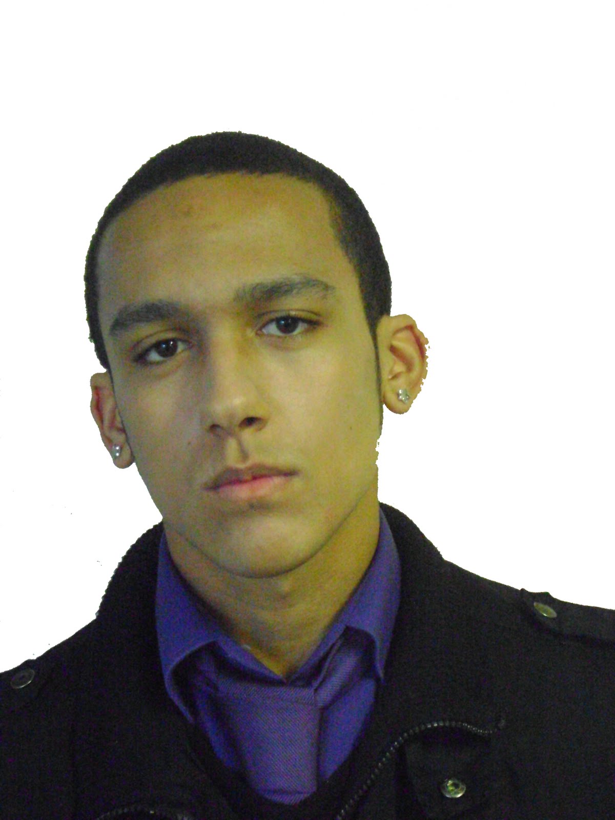
On my “MULA2” Album cover I started by selecting the image of my classmate on Photoshop using the lasso tool in order to separately select the image of my classmate although my limited skill on Photoshop and photo editing in general resulted in a rather choppy image and sharp images, I then decided it would be best to make the picture itself pixelated, and changed the image to match the colours of my classmate's clothing; Black and Purple as I was originally going to include more photographs of this classmate, I thought it may help create an image or style for the fictional artist.

Thursday, 10 December 2009
Subscribe to:
Comments (Atom)