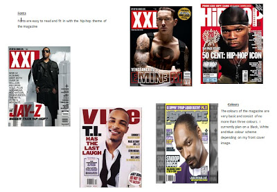
The fonts used in these Hip Hop magazines are simple and easy to read, something that I feel is essential for any magazine, the name of the magazine is predominantly displayed on the top left corner of the front cover. The text never covers the face of the artist displayed on the front cover, or the focus of the image. This is something I must ensure in my final product.
No comments:
Post a Comment